KLOFood
KLOFood
KLOFood

KLOFood: Motivating university students to reduce food waste

KLOFood: Motivating university students to reduce food waste

A sustainability-focused web service that gives food a second life and saves students money

Role

UX/UI Designer

Team

3-member team

Duration

3 months (2022)

Tools

Figma, Miro, Excel

Overview

Food waste is a growing concern for businesses in the food industry and the world. Addressing this problem is a joint effort of policymakers, institutions, businesses, and youths inclusive, particularly university students, through technology.

Solution

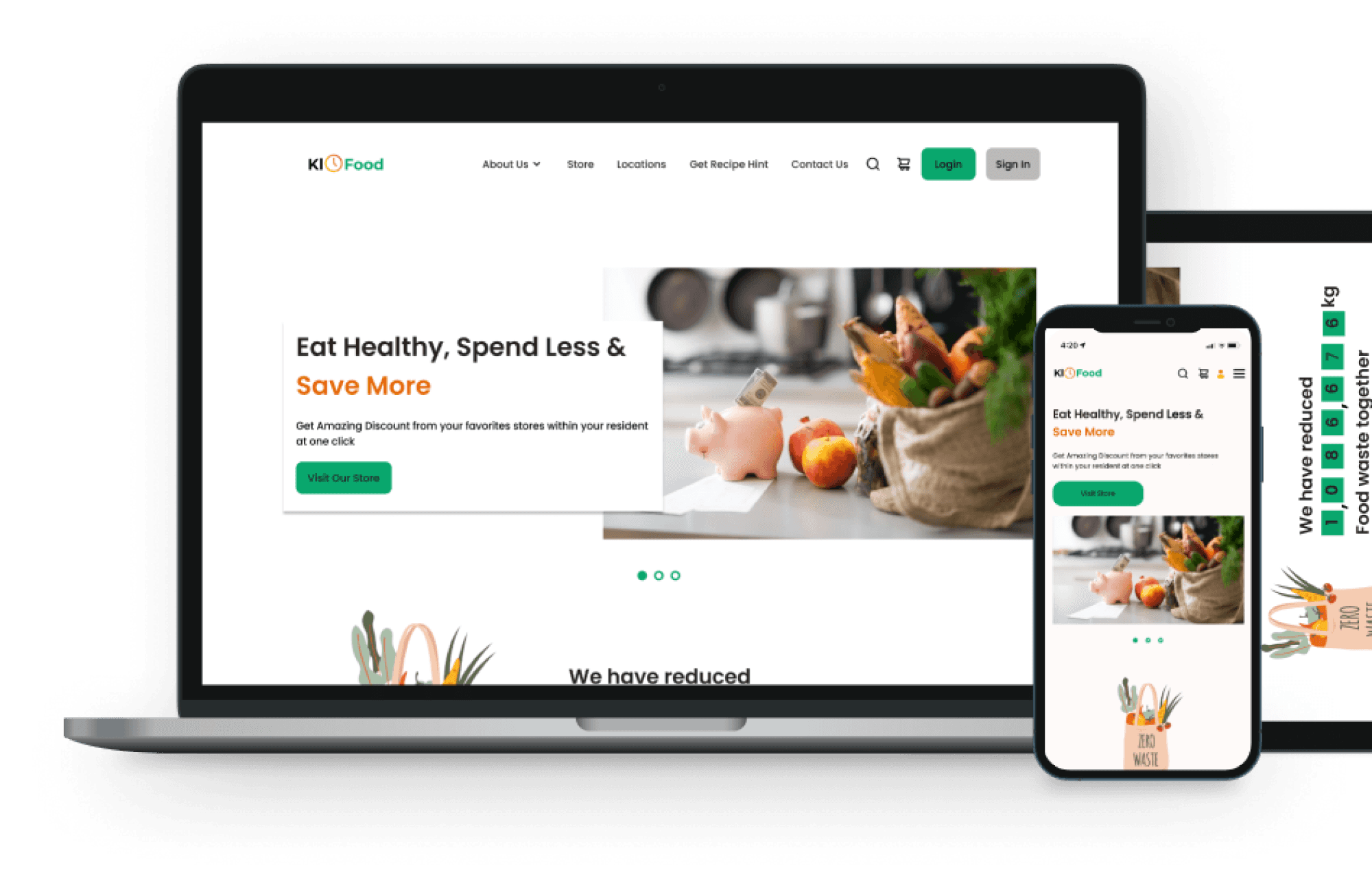
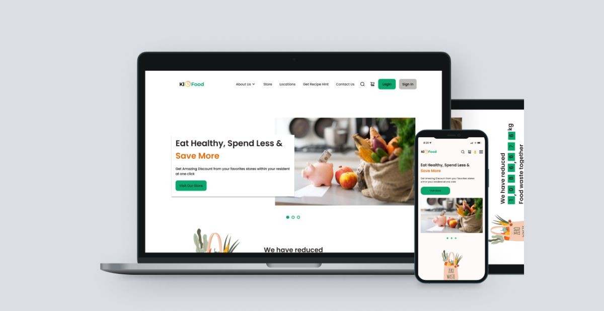
We set out to create KloFood, an online web service intended to motivate university students to reduce food waste by connecting them with restaurants and grocery stores selling close-to-expiry and ready foods/groceries at affordable rates.

Process

Empathise

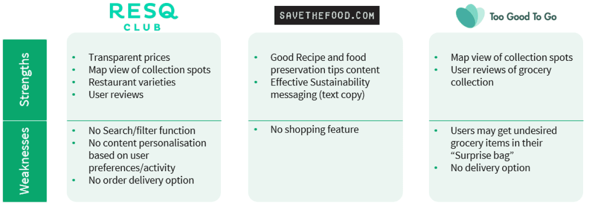
We conducted semi-structured interviews with 9 university students and I did a competitor analysis of 3 existing food waste reduction platforms to derive insights into what features can be improved or included in our product

We conducted semi-structured interviews with 9 university students and I did a competitor analysis of 3 existing food waste reduction platforms to derive insights into what features can be improved or included in our product

Define

With findings from our research using thematic analysis done with Excel, we brainstormed the product’s features, user personas, user tasks, usability and UX goals using Miro


Ideate

The team created initial sketches for different pages for the online platform, including the wireframes, starting mobile-first

Prototype

We came up with the final UI screens and interactive prototype using Figma. I focused on the “Impact”, “Orders” and “Order Tracking” pages and interaction flow between pages and contributed to the UI design of other pages

Prototype

We came up with the final UI screens and interactive prototype using Figma. I focused on the “Impact”, “Orders” and “Order Tracking” pages and interaction flow between pages and contributed to the UI design of other pages

Deliverables

Competitor Analysis

KLOFood competitor analysis


Research Goal & Findings

Goal:
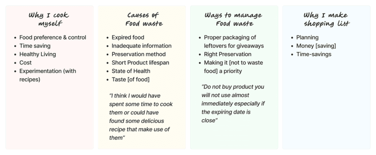
To understand students' grocery shopping routines, dining preferences, food waste management challenges, and strategies.


Findings:

Product features, user tasks, and goals
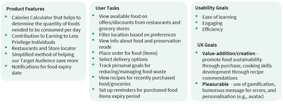
KLOFood product features, user tasks, ux and usability goals


User Personas

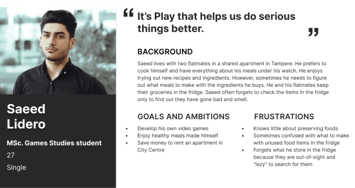
2 Personas were created with different viewpoints based on information from participants
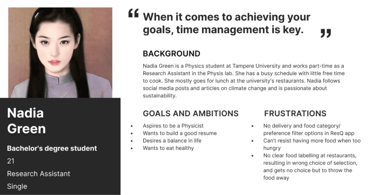
Nadia Green persona 1

Persona 1: Preference for eating out


Saeed user persona 2

Persona 2: Preference for self-cooking


Sitemaps

We compiled and organised the platform's pages into a sitemap
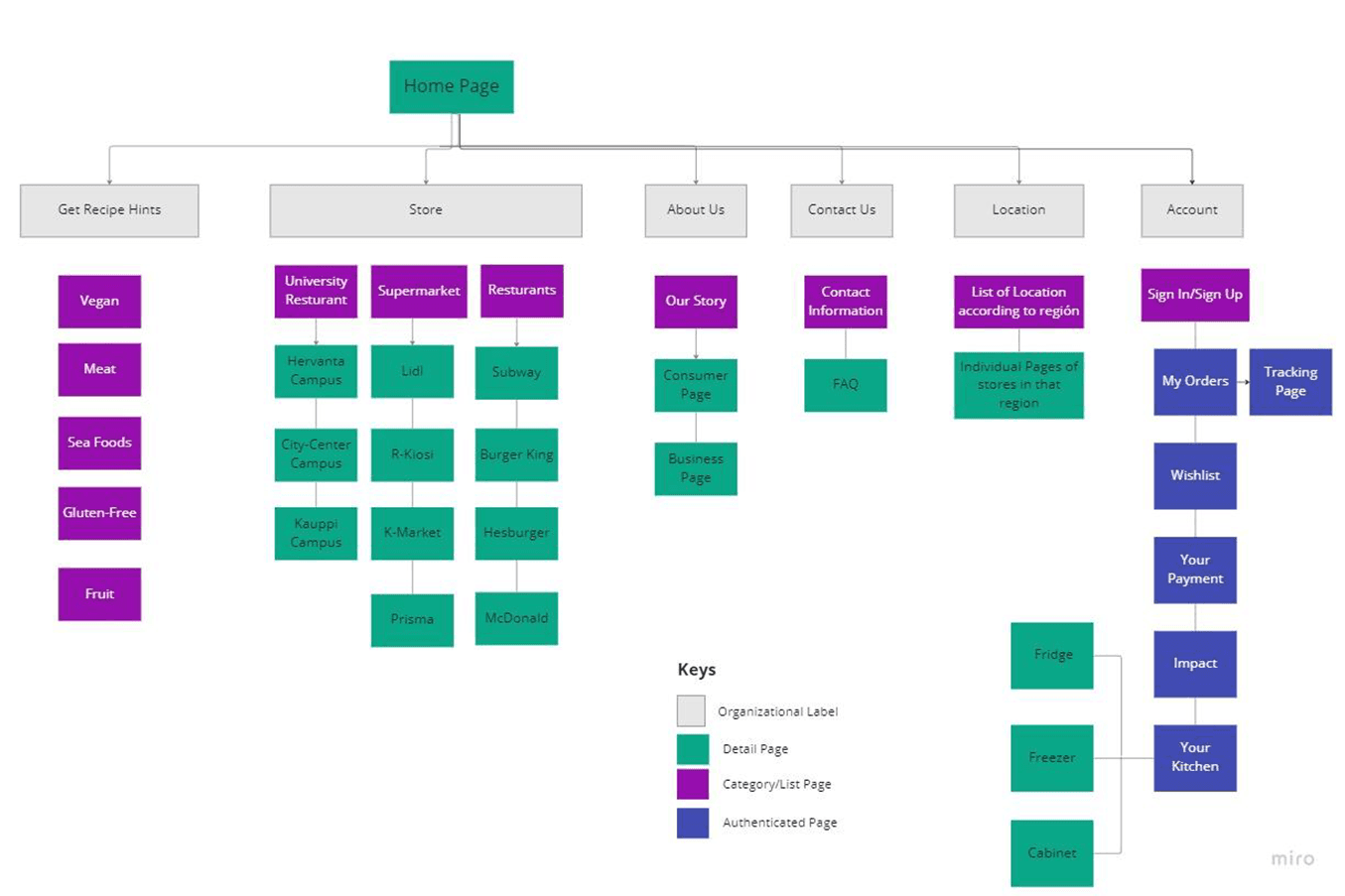
KLOFood Sitemap


Wireframes

Low-fidelity wireframes were created for key screens of the platform such as the homepage, stores, recipes, orders, carts, order tracking, impact, and kitchen.
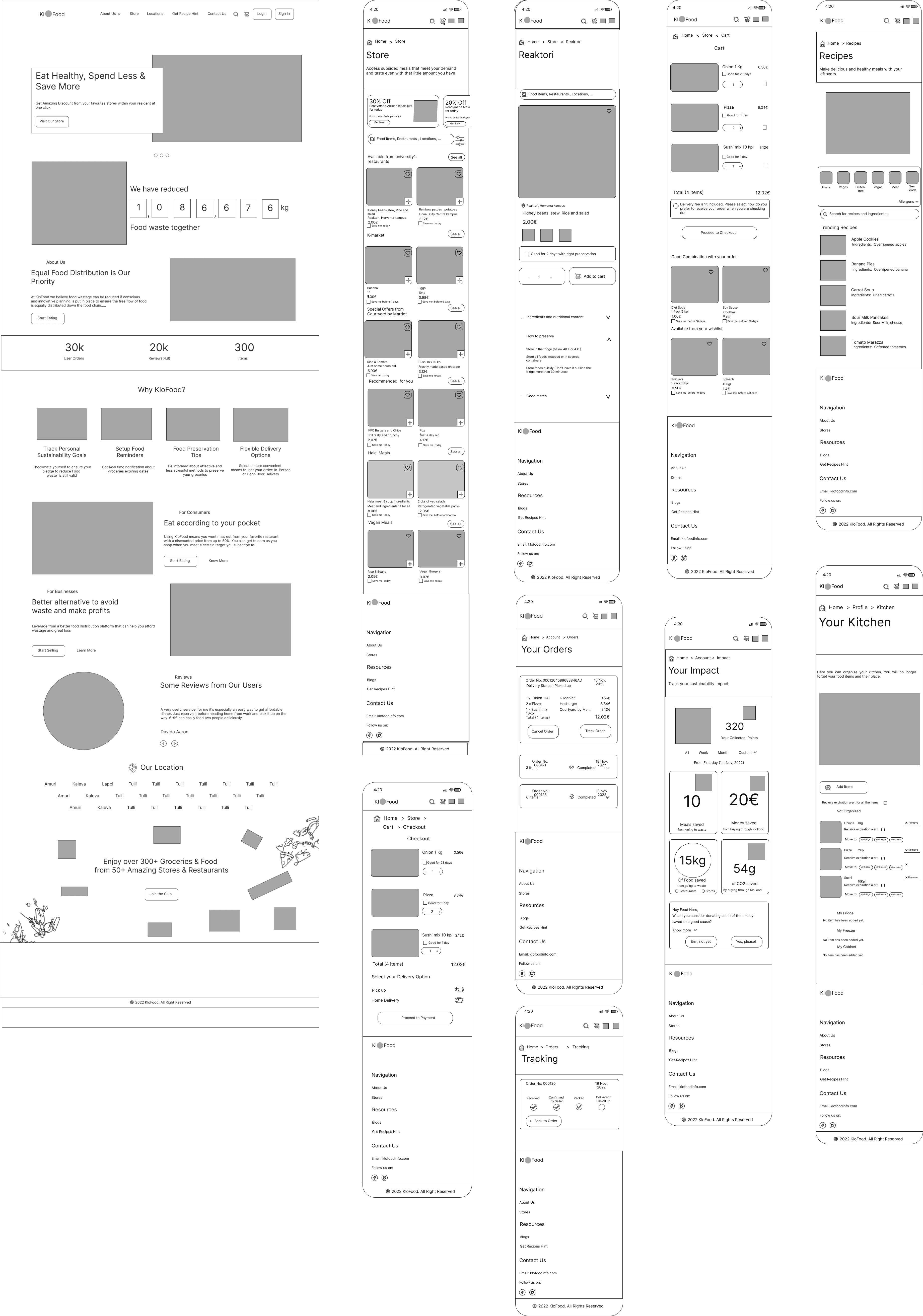

Prototype

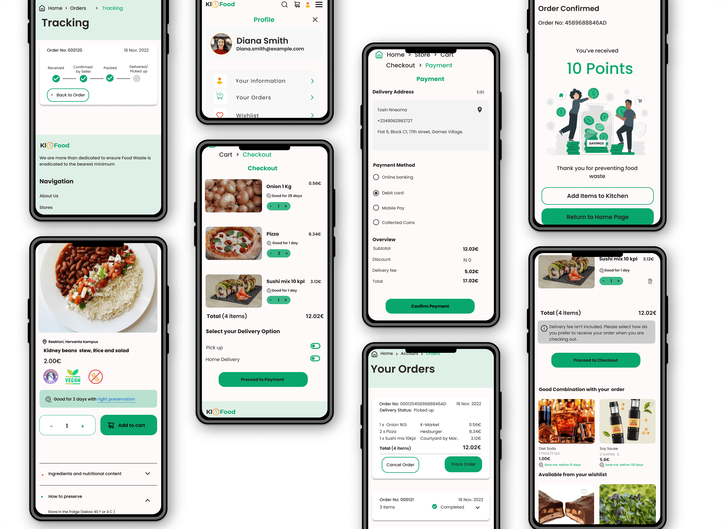
The final UI screens
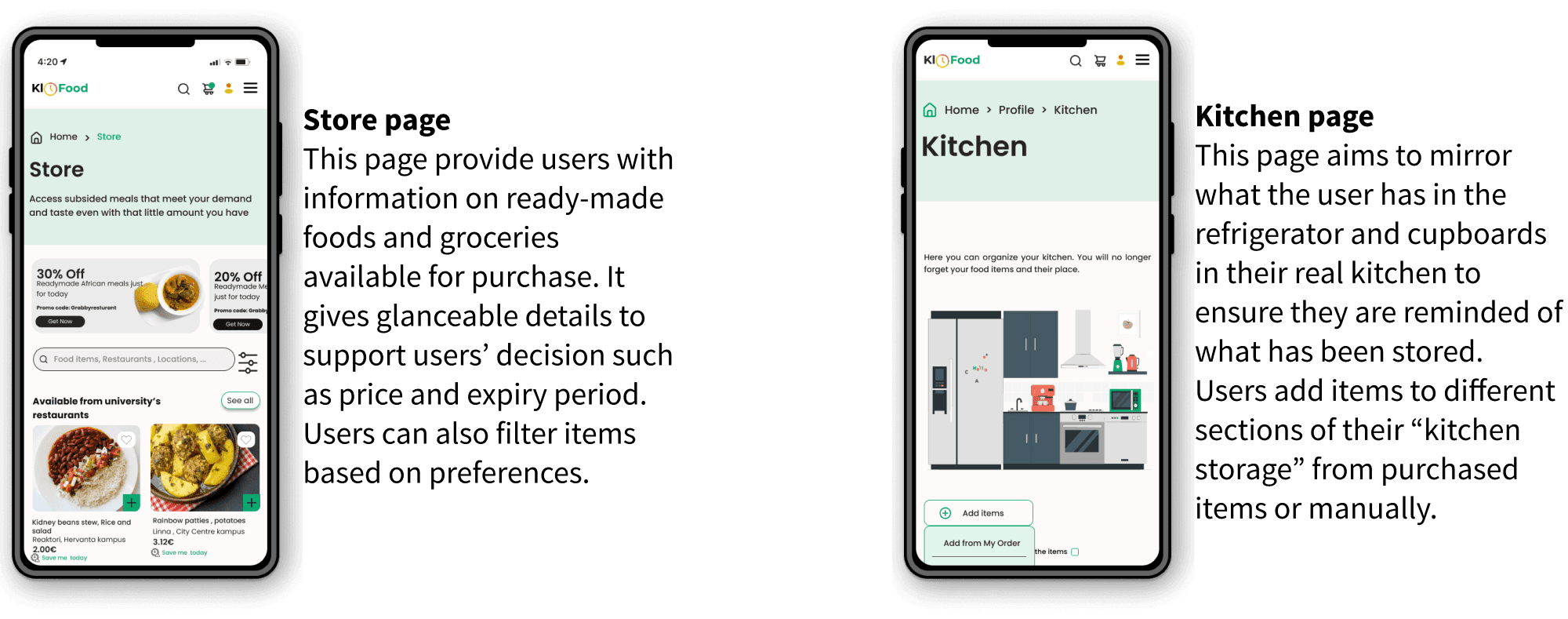
KloFood store and kitchen pages


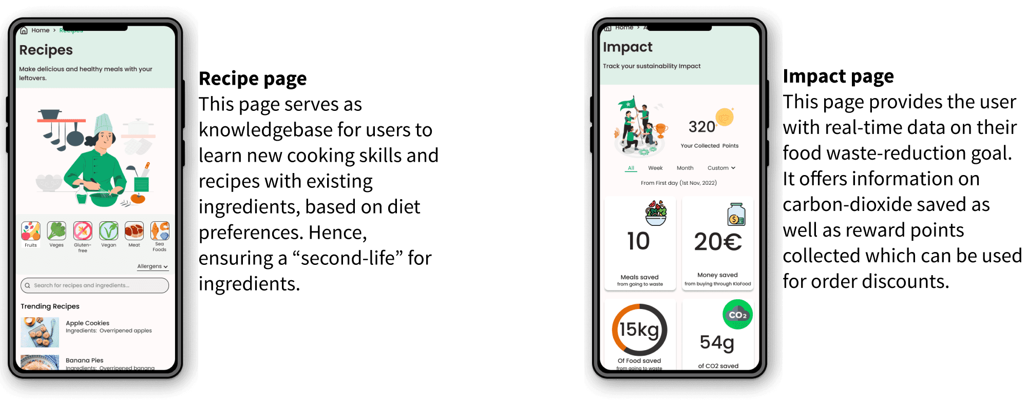
KLOFood recipe and impact pages


KLOFood prototype-3 screens


Impact

With the KloFood platform users can:

Give food a second life: By purchasing close-to-expiry yet still palatable items, users help reduce waste and mitigate revenue loss for restaurants and grocery stores.

Foster a culture of sustainability: Students can cultivate an interest in sustainable practices, track their waste-reduction goals, and earn rewards for their contributions.

Save students money: Accessing close-to-expiry foods and ingredients at reduced prices enables budget-conscious students to maximise their savings.

Improve cooking skills: Utilising recipe recommendations provided by the platform, students can learn new cooking skills and improve existing ones.
Reflections

This was my first user-centered design project, and I learned a lot from collaborating with others.

This was my first user-centered design project, and I learned a lot from collaborating with others.

Key Takeaways: 1. Designers Can Make a Difference: The project, though course-based, highlighted the designer's role in addressing major global issues. 2. Value of Feedback: Peer reviews led to valuable feature additions, though not all could be implemented within the project timeline. 3. Balancing Perfection and Timeliness: Striving for perfection delayed the project. We prioritised main user tasks and used feedback to minimise further delays. Due to resource constraints, we couldn't conduct a usability test or create features for restaurant and grocery store owners.

Key Takeaways: 1. Designers Can Make a Difference: The project, though course-based, highlighted the designer's role in addressing major global issues. 2. Value of Feedback: Peer reviews led to valuable feature additions, though not all could be implemented within the project timeline. 3. Balancing Perfection and Timeliness: Striving for perfection delayed the project. We prioritised main user tasks and used feedback to minimise further delays. Due to resource constraints, we couldn't conduct a usability test or create features for restaurant and grocery store owners.